Showing posts with label American Bookmaker. Show all posts

Thursday, August 22, 2013

Three Men in a Boat. A Published Design Firmly Attributed to Morse


If you are collecting Morse covers you will be happy to know about this cover on a poplular text from the late 19th century. Gullans and Espy attributed a binding for Jerome's Three Men in a Boat (New York: Henry Holt and Company, 1890) to Morse, but I was never quite sure if this was the cover because it seemed at the time, so unlike Morse's work, especially her early work -- which this is.

I was wrong, as this image in The American Bookmaker clearly attributes this design to Morse (May 1890, p. 127). The  pictorial design that Morse made for this book is not quite so successful on the published binding as it appears here. It is stamped in green on blue cloth. The stamping color is simlar in tone to the cloth color, making the detailed design difficult to decipher.  Not in Dubansky.


My copy of Three Men in a Boat


Tuesday, April 9, 2013

Heads or Tails? Morse designs in the American Bookmaker

In earlier posts I mentioned what a wonderful primary resource the American Bookmaker is for information about American decorated book covers, book decorations, illustrations and other subjects of book history. Fortunately, now many issues of the magazine are online and easily search-able. Several years ago, I found these by spending Christmas Eve day in the rare book library at Columbia University looking through all of the issues from the late 1880s through the 1890s. It was transporting to look at the actual magazines; it felt like I could have been in the 1890s just getting up to date with the latest book info. Here are two Morse designs for you to enjoy from the American Bookmaker


Friday, April 5, 2013

A Venetian June


 Here is a lovely grotesque book cover design by Morse that is not in my book, but was discovered in time for the Grolier Club exhibition. As you can see, it is signed AM under the author's name, within the curly leaves of the lower part of the design.

Below is a review of the design in The Bookman, Volume 4. The review also attributes Morse as a designer for some of the volumes in Century's 'Thumbnail Series' and for the singular, classical design of Harper's 'Odd Number Series' and includes a picture of A Venetian June. While we now know that Morse designed at least two of the books for The Thumbnail series (Writing to Rosina and Tracings [see Tracings in an earlier posting), it still remains for me to locate the rest of the books in the series and see which can be attributed to Morse.

Anna Fuller
A Venetian June
New York: G. P. Putnam's Sons, 1896
Printer: The Knickerbocker Press
155 x 110 x 20 mm
Signed

Monday, April 19, 2010

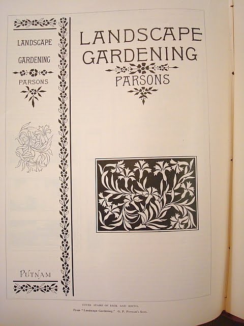
Reference for "Landscape Gardening"

The following reference for this title (Samuel Parsons. Landscape Gardening . . . New York: G. P. Putnam’s Sons, 1891) was not included in my book (see Dubansky Entry 91-10, p. 58). It is a full-page illustration and accompanying review in American Bookmaker, June 1891, “Cover Stamps,” p.180-181.


Cover Stamps.
____
In the present issue of THE BOOKMAKER appear the cover stamps of two books which are to be published at an early day. Of these that on page 180 is to ornament the back and recto of the forthcoming work of Samuel Parsons, Jr., “Landscape Gardening,” of which G. P. Putnam’s Sons are the publishers. The book being bound in cloth of citron shade, the floral and leaf ornamentation and the lettering, which in the reproduction are here given are printed in black, will appear in gold on the book cover, as well as the dark background in which the conventionalized carnations are placed in the lower part of the recto. The appropriateness of the design and the excellence of its mode of treatment are very apparent.
Note: I have never seen this binding in a citron shade, mentioned above, only in green cloth on the spine and the same cloth used in reverse on the sides. As an aside, many of the photographs of landscapes were taken in New York's Central Park.

Buy a copy of The Proper Decoration of Book Covers: The Life and Work of Alice C. Morse
http://alicemorse.blogspot.com/p/buy-book.html

Tuesday, April 13, 2010

Reference for Harper's Odd Number Series

This cover in dark blue cloth with silver stamping is described in the reference below. See Dubansky entry 89-4, pp. 48-49 for a description of the series contents and description of binding variants.

Four volumes of the Odd Number Series, including Pastels in Prose, were produced in a set, bound in white cloth with gold-stamping, top edge gilt and printed endleaves.

Reference: The American Bookmaker, June 1890, “Books, Booklets and Brochures” p. 155:

The little 12mo volume published by Harper & Brothers, called “Pastels in Prose,” has been termed, not inaptly, “a gem of bookmaking.” It forms one of the “Odd Number Series,” so called from the fact that the style of binding which was applied to the initial volume, a translation of Guy de Maupassant’s thirteen tales, is used upon others in the set. It is not at all surprising that the publishers are disposed to perpetuate this book cover design and did not discard it upon the completion of the work for which it was originally drawn. This design was prepared by Alice C. Morse, to whose artistic ability reference was made in THE BOOKMAKER for May, in which another of her cover designs was reproduced. It is somewhat difficult to write a description of the cover stamp which distinguishes the “Odd Number Series” and do just ice to its chaste beauty. It consists of a rectangular framework bordering the recto; within this are segments of minute Gothic arches bordered by straight lines. Within this again are two panels framed in ornamental lines, curves and dot. The upper panel is the narrower and contains the title of the work” the lower panel, four times as long, bears the colophon of the publishers. The binding is in a blue black cloth, which admirable set off the cover design stamped in silver, while the title is in gold letters. Upon the back of the volume the title appears in gold again, while the ornamentation on the cover is sparingly and tastefully employed above and below the title and at the bottom. At the Threshold of the interior a delicately tinted frontispiece is found, and this is succeeded by numerous vignette illustrations, drawn by Henry W. McVickar, which seem to be imbued with the spirit of the context. One of these, which accompanies a tale of “Clown and Columbine,” is given on page 153 of THE BOOKMAKER. There are nearly three hundred pages to this volume, will printed on excellent paper and a finishing touch is added by imparting to the upper edges of the leaves a light yellow tint.

Buy a copy of The Proper Decoration of Book Covers: The Life and Work of Alice C. Morse
http://alicemorse.blogspot.com/p/buy-book.html